The London Underground (or the “Tube” as we like to call it here) has arguably the most iconic map in the world. The circuit-diagram style map invented by Henry Beck in 1933 paved the way for the way in which most modern metro/subway systems portray their transit networks today. Its success in aiding the traveller to find their way from A to B is a testament to its simplicity and as the saying goes “it it ain’t broke, don’t fix it“.
As the underground has expanded and changed over the years so Transport for London has updated and tweaked the map. Fair enough, but unfortunately it appears that their designers have got a bit carried away and with every new version it seems to be getting more and more complex and cluttered.
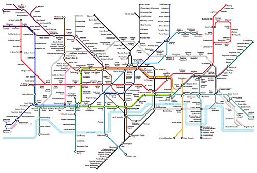
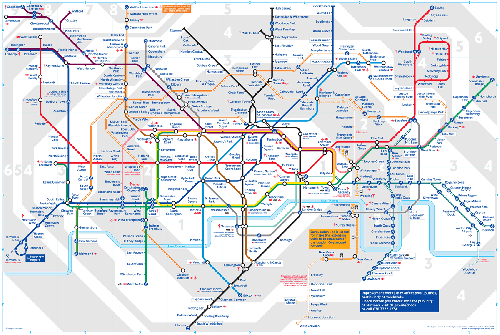
For an idea of what I mean just compare the 2004 & 2008 editions of the map:

London Underground Tube Map 2004

London Underground Tube Map 2008
I think you’ll agree that the differences are striking. The main things which come to my mind:
- Adding background shading to show the zones is irrelevant and distracts the eye; when was your decision to go somewhere last influenced by what zone it was in?
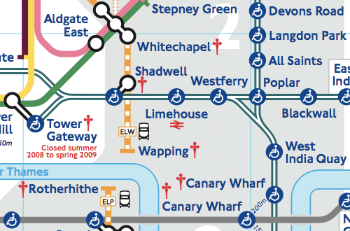
- Adding the blue step-free access signs only helps a tiny fraction of map users and actually removes detail as you can no longer tell which stations are interchanges; why not have a separate map showing disabled access provisions?
- The new “London Overground” lines are a glaringly poor addition; they feel like they have been drawn around the existing map rather than integrated with it – is trying to bring together over & underground maps really a good idea?
- The tiny red symbols, indicating “Check before you travel” in the key, are completely pointless and only add more visual clutter; they look more like crucifixes to me!

So there you have it – how to ruin a design classic in four easy steps!
Update (12 Oct 2009): TfL has introduced a new map which addresses a lot of these issues. I’ve reviewed it here.

Reply