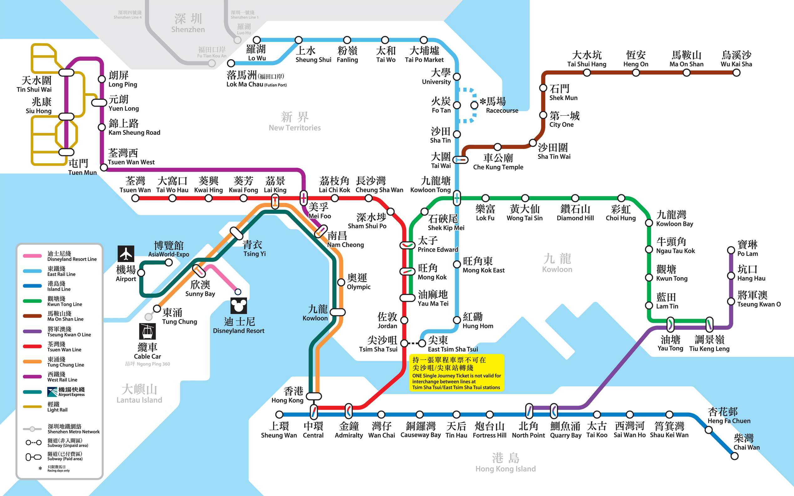
It’s no secret that I love system map design. There’s something intrinsically beautiful in being able to represent a complex network of lines, interchanges and stops in a simple map which just about anyone can easily follow. As I found out last weekend Hong Kong doesn’t have a huge metro system but it does have a very nice map that concisely represents both the lines and the landmasses which it spans (encompassing two islands and soon to be connected to mainland China) as well as providing duel language labels (Cantonese and English).

It appears to be based on the same design principles as employed to create the original London Underground map but has so far avoided the pitfalls which have ruined its older counterpart. They seem to have found the perfect balance between providing not enough information and just enough.
If you like this sort of thing you may be interested to see that the 2002 classic “Atlas of Cyberspace” book which chronicled the history of visualisation and the design of maps that explored the digital landscape has now been released under a Creative Commons licence as a free PDF download. I remember first reading this book when I was at school and being fascinated by the amazing new world it depicted. Although some of the content is now a little dated it’s well worth a read, if only for the amazing pictures! [via]

Reply