Walk into almost any shop. Regard the tacky watches, the rip-off tablets, the cheap radios, and the clothes that fall apart after the second time you wear them. Most products today have had little thought or care gone into their design, focusing on fashion over function and cost over quality. They are marketing-driven ploys that deceive the consumer into a never-ending cycle of designed obsolescence where the value of a product has become less about what it does and more about having the latest model.
I don’t want things for the sake of having, but for the sake of needing and making life easier. For this reason, I have grown an intense dislike for being forced to wade through the sea of mediocre choices every time I go shopping. In a world where the population is growing fast and resources are becoming scarce things have to change. There is, however, a glimmer of light from the few companies which dare to do things differently.
Below I’ve taken a look at five of the best companies driven by principles of good design, who I admire, and tried to dissect what makes them tick and ultimately what makes them successful.
MUJI
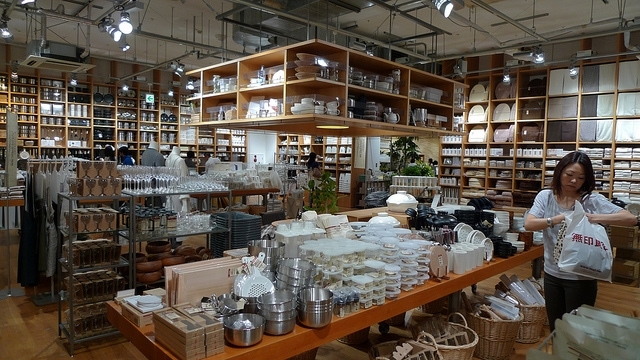
Born in Japan in 1980, MUJI (無印良品) was conceived to be different from the start. Its name means “no brand quality products” which encapsulates its aim to simply to make what is necessary, nothing more and nothing less. They achieve this by surveying thousands of customers to understand what they need, and then they try to meet these needs in the simplest, cheapest ways possible. Today they have over 200 stores in 20 countries with more than 7,000 household and consumer items sold as MUJI products:
Not a fancy towel, but a useful towel. Socks with right angles like feet. Comfortable sheets for a comfortable bed. Beautifully simple bicycles. Functional but never boring writing accessories. Cutlery that fits your hand like a glove. – MUJI
These principles extend to their stores which provide a pervasive sense of calm and order as the backdrop to their neutral nondescript products (some even include tasty cafes). I find it a welcome break from the usual in-your-face logos and over-the-top design found elsewhere. MUJI’s natural, simple, and anonymous design proposes rational lifestyles for today’s world while also being forward-thinking – their recently introduced iPad apps that continue these ideas beyond material goods.
Philosophy: “No Label. Good Products”
- MUJI is not a brand whose value rests in the frills and “extras” it adds to its products
- MUJI is simplicity – but a simplicity achieved through a complexity of thought and design
- MUJI’s streamlining is the result of the careful elimination and subtraction of gratuitous features and design unrelated to function
- MUJI, the brand, is rational, and free of agenda, doctrine, and “isms”
- MUJI aspires to modesty and plainness, the better to adapt and shape itself to the styles, preferences, and practices of as wide a group of people as possible
UNIQLO
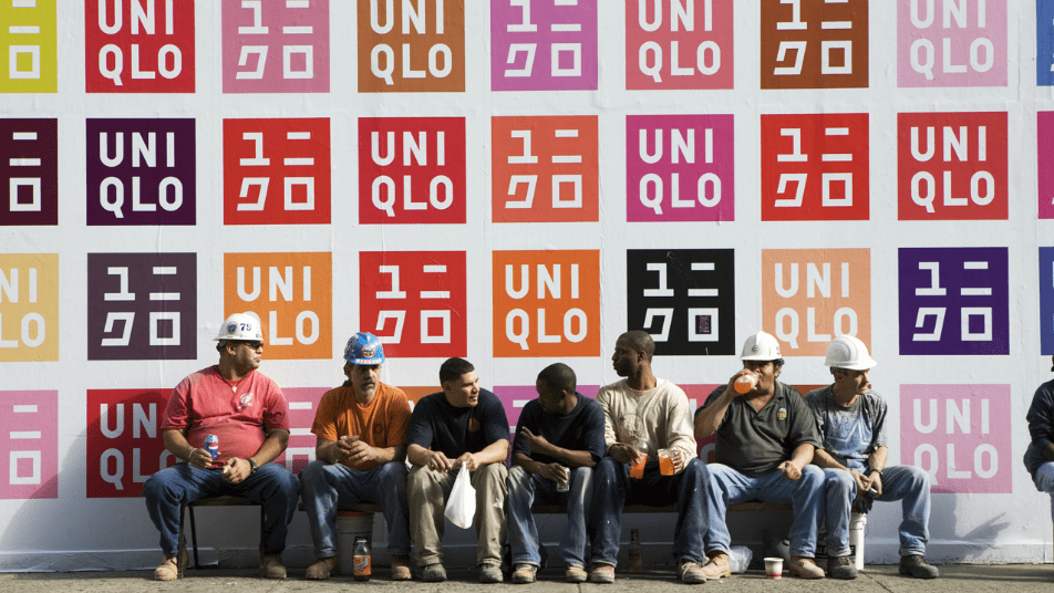
UNIQLO (ユニクロ) is a Japanese casual wear designer, manufacturer and retailer whose aesthetic is clean, simple, organised, and vibrant. The name is a contraction of “unique clothing” and far from being a lifestyle brand, their stores offer a white box on a white background filled with thousands of UNIQLO items stacked floor to ceiling, arranged in a rainbow of colours. UNIQLO has ~1000 stores worldwide (90% in Japan) and is aimed at the urban basics shopper, promoting a kind of no-fuss individualism.
By producing a relatively small number of styles in a large number of colours it enables them to attain economies of scale while at the same time disguising this fact through the multitude of colours on display. It delivers a low-cost product that shares the qualities of high-end retail. Unlike contenders such as H&M, UNIQLO customers expect to wear their clothes until they wear out.
Over the past few UNIQLO has run a string of innovative projects as marketing campaigns: MIXPLAY, UNIQLO JUMP, UNIQLOCK (my favourite), UNIQLO Calendar (for iPhone/iPad) and most recently 88 COLORS in Shanghai which have successfully combined music + physical expression to create a communication vehicle which works across cultures globally. UNIQLO also runs competitions every year to and select designs for their popular UT t-shirts contributed by artists and photographers online.
Philosophy: “Made for All”
- UNIQLO makes clothes that transcend age, gender, ethnicity and all other ways that define people
- UNIQLO clothes are simple and essential yet universal, so people can combine them with their own styles
- UNIQLO aspires to excellence in quality, design and technology while remaining affordable to everyone
- UNIQLO is a way of thinking that’s about constant change, diversity, and challenging conventional wisdom
- UNIQLO believes that everyone can benefit from simple, well-designed clothes
IKEA
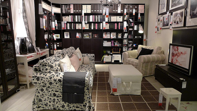
Synonymous with cheap flat-pack furniture, IKEA was founded in Sweden in 1943 and has grown to become the largest furniture retailer in the world with over 300 stores in nearly 40 countries. While self-assembly enables IKEA to reduce costs and make transportation easier, beyond this the company maintains an almost religious belief to improve not just the lot of people, but the people themselves by encouraging them to take control:
We have decided once and for all to side with the many. What is good for our customers is also, in the long run, good for us… Happiness is not reaching your goal. Happiness is being on the way. – The Testament of a Furniture Dealer by Ingvar Kamprad
IKEA stores are easily distinguished by their very large blue buildings with yellow accents (Sweden’s national colours) and few windows. They are designed with a one-way layout, leading customers through the whole store in its entirety with a series of showrooms upstairs and a “Market Hall” downstairs. It’s common for families to make a day trip out of a visit to IKEA and many stores have restaurants serving traditional Swedish food alongside varieties of the local cuisine in each country.
In response to the explosion of human population and material expectations in the past century, IKEA contends that it has been a pioneering force in sustainable approaches to mass consumer culture, a concept which its founder Ingvar Kamprad refers to as “democratic design”; the combination of attractive form, inexpensive production, and high function. The intended result is flexible, adaptable home furnishings, scalable both to small apartments as well as large houses. The higher aim is freedom in all senses of the word.
Philosophy: “To create a better everyday life for the many people”
- IKEA focuses on good design and function at a low price
- IKEA has something for the romantic at heart, the minimalist and everyone in between
- IKEA products are designed to meet your day-to-day needs and eliminate the unnecessary
- IKEA is constantly trying to do everything a little simpler, more efficiently and always cost-effectively
- IKEA maximises the use of raw materials in order to fulfil people’s needs and preferences
Dyson

Britain has a proud tradition of lone inventors coming up with new ideas in their garden sheds and Dyson’s founder, James Dyson, famously created 5,127 prototypes of his first machine, the Dual Cyclone bagless vacuum cleaner, in a workshop behind his house, before developing one that he considered worked perfectly, the DC01.
I have not failed; I’ve just found 10,000 ways that won’t work. – Thomas Edison
Dyson’s breakthrough idea was to use cyclonic separation to create a vacuum cleaner that would not lose suction as it picked up dirt and didn’t require a bag. At the time, in the early ’90s, manufacturers didn’t want to touch his design since the market for disposable cleaner bags was enormous so he started his own company and after much effort eventually became the market leader.
The company has since gone on to create radically new designs for washing machines (ContraRotator), hand dryers (Airblade), fans (Air Multiplier) and heaters – while not all have been hits, their ability to reinvent entire product categories is almost unparalleled.
Dyson’s background was in industrial design, rather than engineering – a fact which is strongly reflected in the sculptural nature of his products which outwardly reflect their functional nature while being strangely attractive in their two-tone bright grey/yellow colours. He has stated the source of his inspiration comes from frustration – if a problem exists, then logically a solution must too.
Philosophy: “Solve the everyday problems others seem to ignore, whatever it takes”
- Dyson emphasises function over form; products are only truly beautiful if they work well
- Dyson keeps on failing till they find the right solution through rapid prototyping
- Dyson products express the technology used so that people understand it
- Dyson encourages differences; be deliberately obtuse and intentionally illogical
- Dyson products repurpose ideas from other applications
Apple
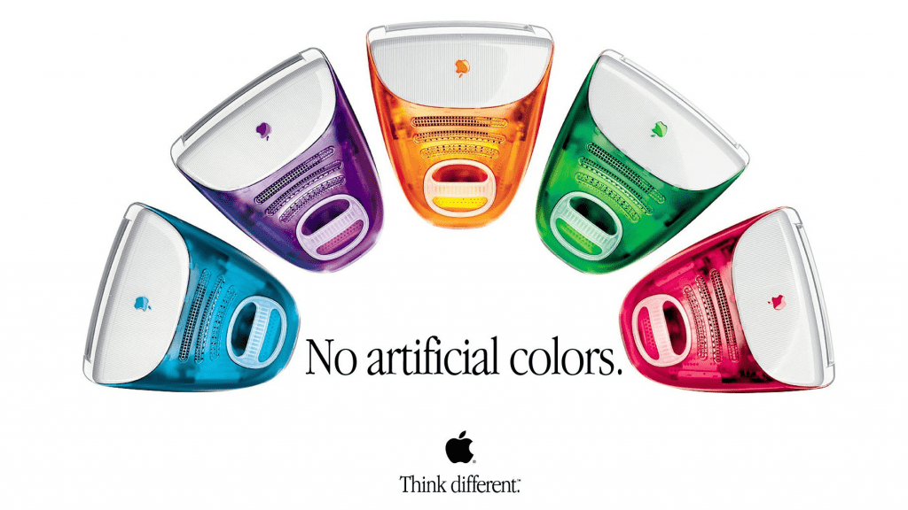
Apple and its founder need little introduction, but while Steve Jobs made design a chief element of the company’s product strategy, it was British designer Jonathan “Jony” Ive who establish the firm’s leading position with a series of functionally clean, aesthetically pleasing and remarkably popular products that started with the introduction of the iMac in 1998. The success of the original iMac helped pave the way to many other iconic designs such as the iPod and eventually the iPhone.
We’ve always tried to be at the intersection of technology and liberal arts, to be able to get the best of both, to make extremely advanced products from a technology point of view, but also have them be intuitive, easy to use, fun to use, so that they really fit the users – the users don’t have to come to them, they come to the user. — Steve Jobs
Like handcrafted Shaker furniture each Apple product is just as beautiful on the inside as it is on the outside and feel almost inevitable or undesigned since they defer to how the user interacts with them in a natural and essential way. Apple products are far more than a collection of parts – their simplicity belies the complexity of the processes which are required to make them.
The work and principles of Dieter Rams, the former Chief of Design at Braun (1961-95), is said to have influenced Ive’s work, and Rams publicly states that Apple is the only company designing products according to his Ten principles of “good design”. Rams once explained his design approach in the phrase “Weniger, aber besser” which translates as “Less, but better”, something that Apple has clearly embraced with its tightly curated product lines that don’t reserve their best innovations for their most high-end products.
Philosophy: “The intersection of technology and liberal arts”
- Apple products are as beautiful internally as they are externally (craft)
- Apple understands what people need before they know they need it (empathy)
- Apple understands that people do judge a book by its cover so first impressions count (impute)
- Apple understands the hierarchy of what is and isn’t important (focus)
- Apple refines every detail in the service of the user to get rid of complexity (simplicity)
Conclusion
As creators, consumers and conservators we shouldn’t accept shoddy design. Companies, like the ones above, which focus on providing what people need now and in the near future in the simplest possible fashion will stand the test of time – their legions of fans stand as a testament to this.
In homage to Mr Rams (who I saw speak at BODW in Hong Kong this week) I’ve put together my own list of what good design is derived from the principles of MUJI, UNIQLO, IKEA, Dyson and Apple:
- Good design is simple
- Good design is pure
- Good design is self-sufficient
- Good design is essential
- Good design is iconic
- Good design is seductive
- Good design is reactionary
- Good design is intuitive
- Good design is democratic
- Good design is universal
I’d be interested to hear what other companies you think would fit into this list?


Reply